- fab fa-linkedin-in
- fab fa-facebook-f
- fab fa-instagram
- fa-brands fa-x-twitter
.jpg)
تصميم علبة وكرتونة منتج صحي نسائي راف باور فى جدة الاحترافية - المملكة العربية السعودية
.jpg)
تصميم علبة وكرتونة منتج صحي نسائي راف باور فى جدة الاحترافية - المملكة العربية السعودية
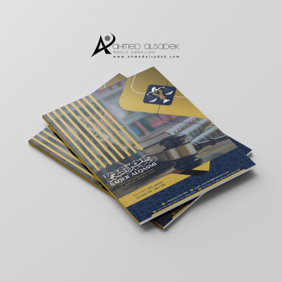
.jpg)
تصميم لوحة واجهة مكتب المحامي مشاري المطيري حروف بارزة مضيئة كلادينج فى خلفية الحروف في الكويت
The Widgetkit Accordion enables you to display a set of items in a compact space, by clicking on each items header it expands or collapses it's content section.
Features
- Clean and very lightweight code
- Responsive design to fit all device resolutions
- Smooth transitions on content section toggle
- Option to match automatically the height of varying content
- Option to auto collapse or allow multiple opened items
- Built with HTML5, CSS3, PHP 5.2+, and the latest jQuery version
- Works with Joomla and WordPress
Example
Slide 1

Headline
Lorem ipsum dolor sit amet, consectetur adipisicing elit, sed do eiusmod tempor incididunt ut labore et dolore magna aliqua.
Slide 2

Headline
Lorem ipsum dolor sit amet, consectetur adipisicing elit, sed do eiusmod tempor incididunt ut labore et dolore magna aliqua.
Slide 3

Headline
Lorem ipsum dolor sit amet, consectetur adipisicing elit, sed do eiusmod tempor incididunt ut labore et dolore magna aliqua.
Slide 4

Headline
Lorem ipsum dolor sit amet, consectetur adipisicing elit, sed do eiusmod tempor incididunt ut labore et dolore magna aliqua.
How To Use
The Widgetkit Accordion lets you easily create and manage all the accordions contents through the user-friendly Widgetkit administration user interface. After you have created an accordion you can load it anywhere on your website using shortcodes or the universal Widgetkit Joomla module or WordPress widget.
.jpg)
تصميم واجهة كوفي شوب - مافن كافية الاحترافية فى دبي الامارات العربية المتحدة